Client Name
UX/UI & Development
Platform
URL
Free Lives
Sam Wilson
WordPress
For this project Free Lives (a local independent gaming company of international acclaim) approached me to relook the design and UX of their existing website. Feeling it was too cluttered and complicated, I was asked to simplify the site while platforming their existing titles in an aesthetically pleasing way. I am very proud of the result and Free Lives were very happy with their cleaner and snappier website.


Client Name
UX/UI & Development
Platform
URL
The Cape Institute of Endocrinology
Sam Wilson
WordPress
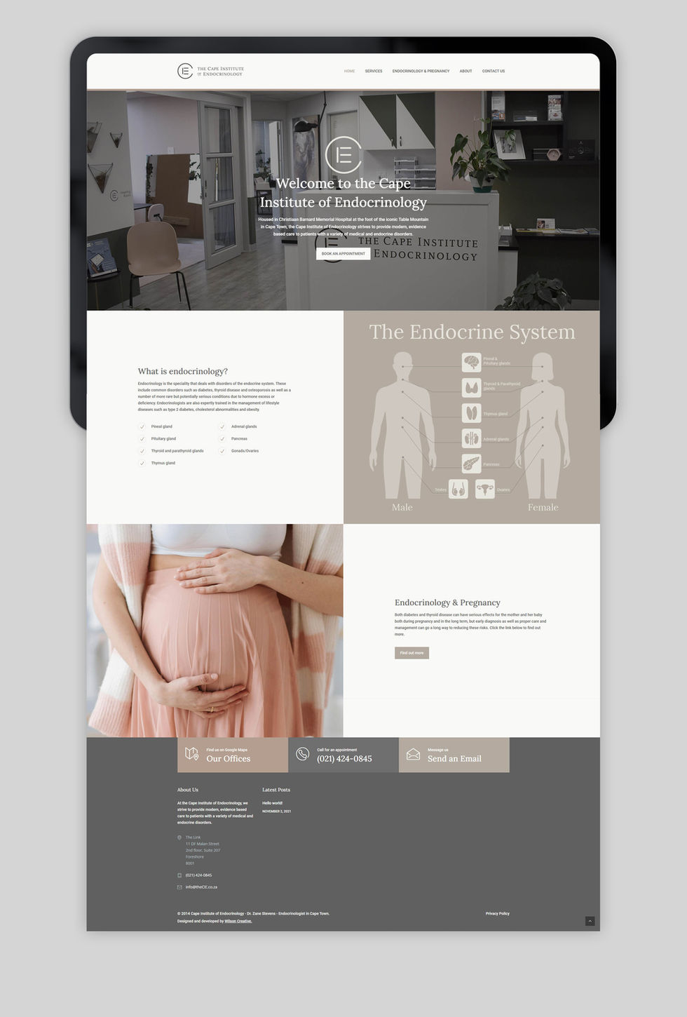
I was asked to do a complete redesign of the Cape Institute of Endocrinology's website. The new design features a modern and user-friendly interface, making it easier for patients to find the information they need. The website also includes a new appointment booking system, allowing patients to schedule appointments online. Overall, the redesign has greatly improved the user experience and increased patient engagement with the institute.


Client Name
Layout/Design/Development
Art Direction/Photography
Platform
URL
Provenance Skincare
Sam Wilson
Sam Wilson
Shopify
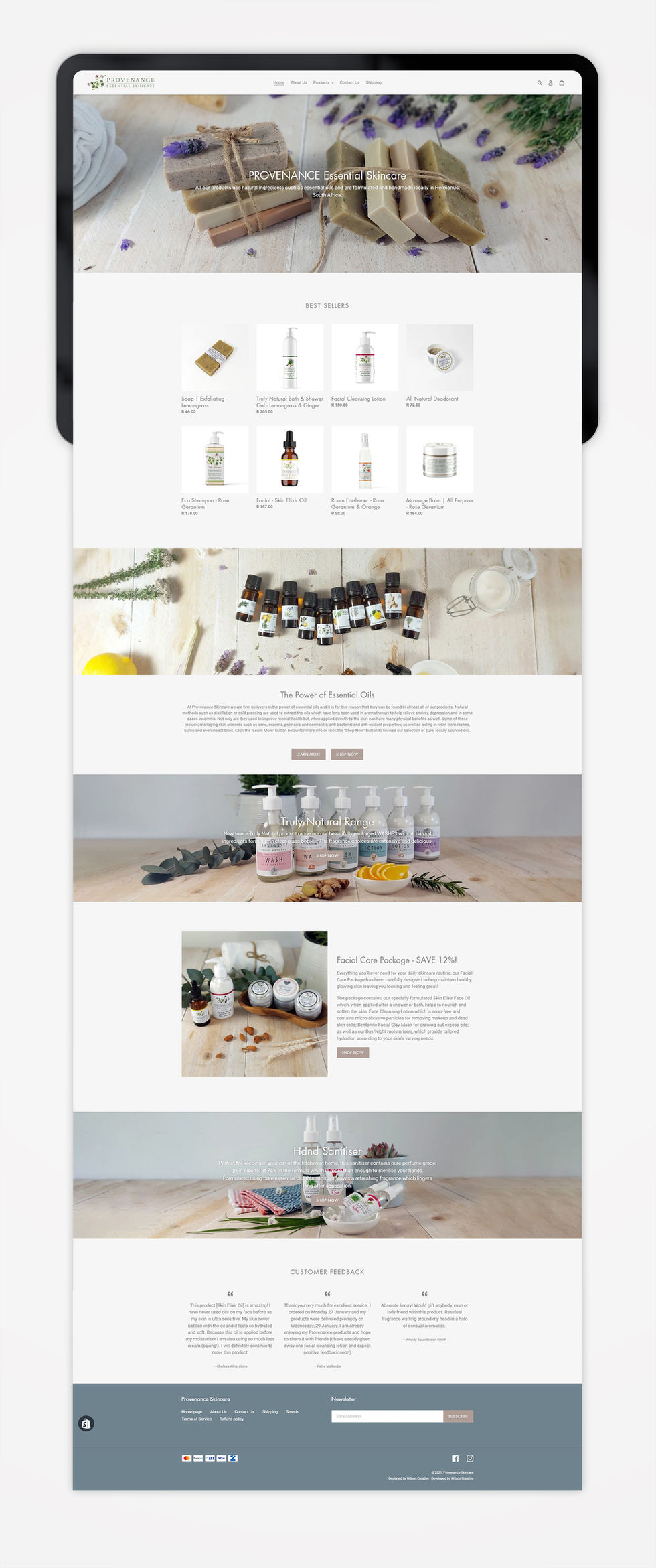
For this project I was asked to design and develop Provenance's ecommerce site to be clean, easy to navigate and to be more in line with their upmarket offering. Using Shopify as the platform I customised the default "Debut" theme using a combination of HTML, CSS, Javascript and Liquid (Shopify's template based language) to add new pages and sections as well as make modifications such as; adding an ingredients section to the product pages; making the main navigation bar "sticky"; and adding hoverable dropdown menu's to the main navigation bar to name a few.
The logo, CI, design, art direction and photography are all my own. Check out the website here.


Client Name
UX/UI & Development
Platform
URL
Conways of Oxford
Sam Wilson
WordPress
For this job I was approached by a well established, boutique optician based in the UK looking to update and modernise their website. Looking to attract a younger target market I used bold imagery and a clean layout for a fresh looking website the client was very pleased with.


Client Name
UX/UI & Development
Platform
URL
Wepex
Sam Wilson
WordPress
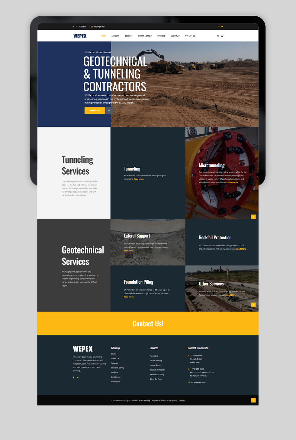
WEPEX is an African based Geotechnical and tunneling contractor who were looking to update and modernise their online presence. Their exiting corporate identity consisted of mainly blues and greys, so I added touches of yellow to draw the eye to important elements on the site. This also synergised well with the actually machinery which is often yellow for the exact same reason.


Client Name
Layout/Design/Project Management
Developer
Twisp
Sam Wilson
CodePlease
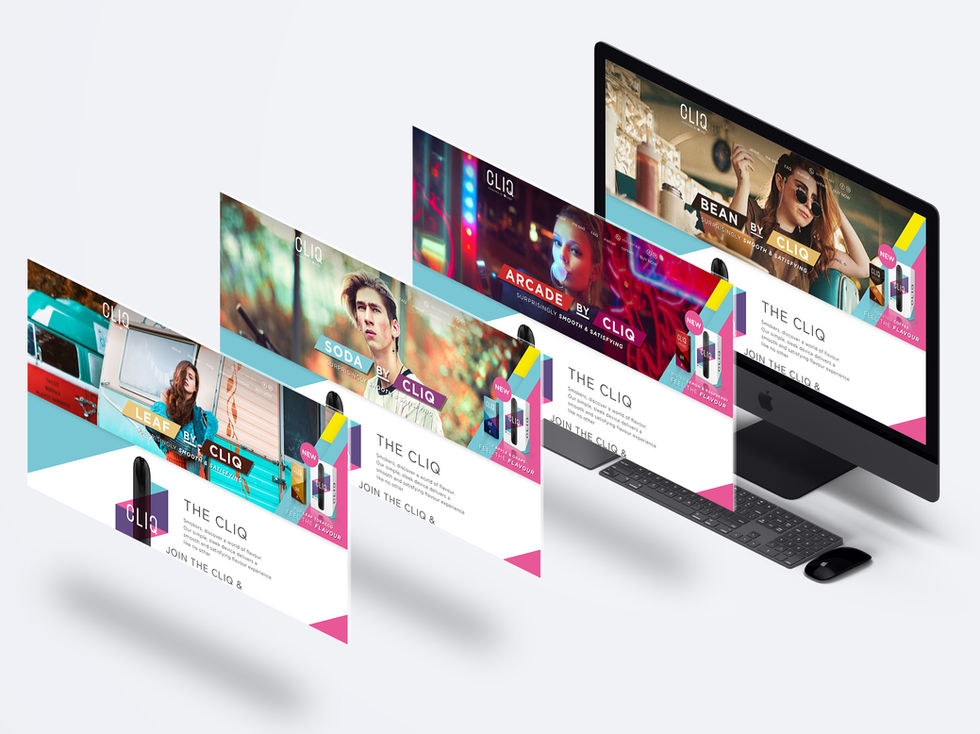
Established in 2008, Twisp is the largest and most popular vapour brand in South Africa. With the launch of their new device, Cliq, which features a disposable pod system as well as a new nicotine salt formulation, I was asked to design all banners, elements and layout as well as manage the development team on this project.
The company has since been bought by British American Tobacco and the device is being phased out in favour of their international equivilent, Vuse. As such the website has been taken down but the below is how the site looked at launch.


Client Name
Layout/Design/Project Management
Developer
ChaufHer
Sam Wilson
CodePlease
ChaufHer is a female drivers and passengers only ridehail startup aimed at creating a safer transport solution for women in South Africa. For this project I was asked to design and project manage the development team in order to ensure that the finished product looked and functioned as close to our original design presentation as possible.
Check out the website here.

